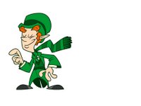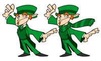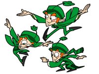
A half a year ago, as a favor to some old friends, I joined a merry band of misfits on the following task.
The mission:
Update an old and highly recognizable favorite.
The specs:
Make it more mature. (edgy)
More it more graphic.
Try to incorporate more "cool" magical elements, like that cool Harry Potter, which all the kids seem to like these days.
The result:
Maybe we shouldn't throw away 40 years of brand equity on a poorly thought-out attempt to cash in on a trendy fad. Nevermind, we'll stick with what we have.


5 comments:
You guys are looking into redesigning the Lucky Charms leprecaun? I think he came out really fun, Campbell! I'm assuming by your post that they turned down your suggestions?
I hung out with a couple of your old chicago co-workers the other day. At least I think I did. Did you work with Darryl Young, Joe Merideth and BJ Crawford?
They have a blog up now as well:
http://www.chewblog.blogspot.com/
I remember seeing these in rough form. They were really nice then too. Too bad they won't get used... but at least the drawings are cool.
Glad you liked 'em.
Steve - No, it wasn't at the Trap, it was elsewhere. From what I heard, they soured on the idea of the re-design, rather than any particular designs. All for the best, I think. Why screw with a classic?
I worked with Joe while I was in Chicago, but only know the other guys by name. Thanks for the blog-link, they've been posting some nice stuff there.
Jeremy - That's funny, I'd forgotten I showed anybody those.
At least somebody's getting to see the final product at all now.
Campell, love them all. I haven't seen the animated redesign but saw the one they went with. I think they made him a little more angular but overall not very different. Keep selling that sugar Lucky!
I'm glad they stuck with with the more classic design myself.
They did add a forth finger though. Which can be tricky if you're not paying attention.
Post a Comment